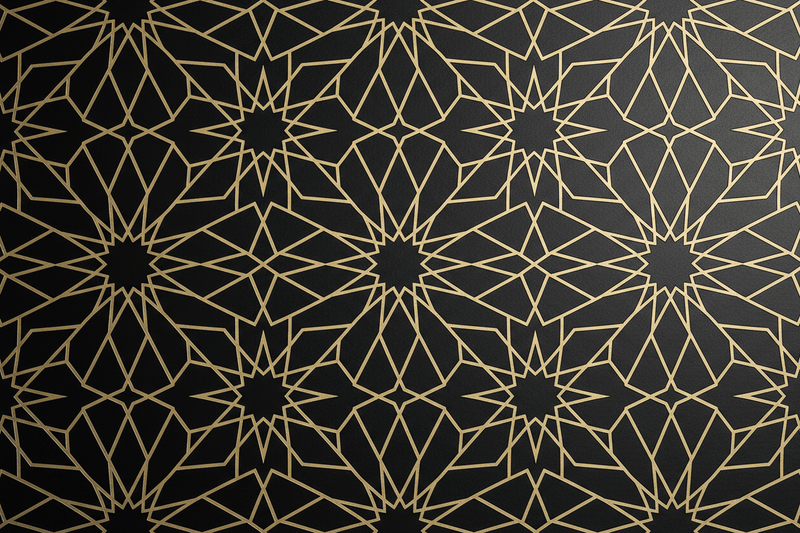
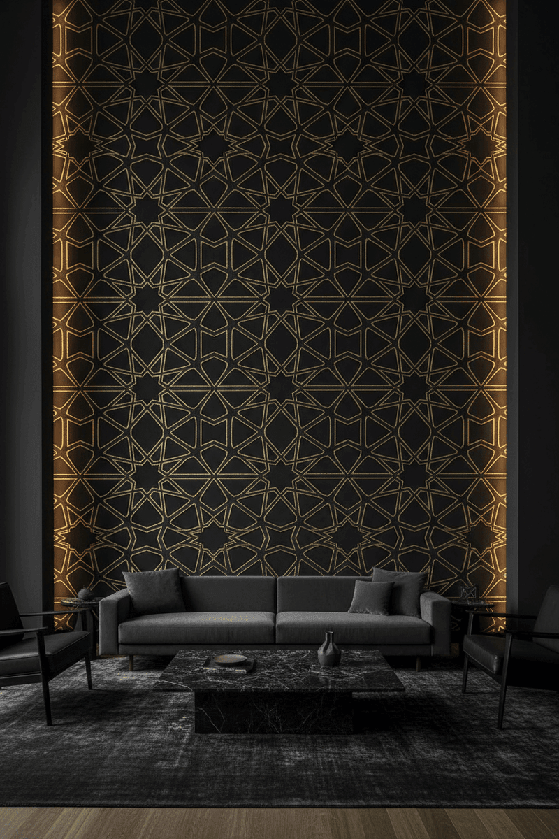
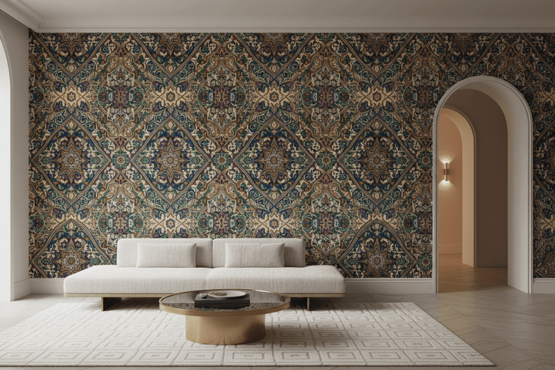
Moroccan wallpaper has become one of the most searched interior design terms of recent years — and yet it is also one of the most misunderstood. The term is used loosely to describe a wide range of geometric and ornamental patterns, not all of which are genuinely Moroccan in origin. If you are serious about bringing authentic Moroccan or Moorish design into your home, understanding the distinctions matters. This guide will help you navigate the landscape with confidence.
What Do We Actually Mean by "Moroccan" Wallpaper?
When most people search for Moroccan wallpaper, they are reaching for a feeling — something geometric, intricate, and evocative of North African and Andalusian design. But the patterns associated with this aesthetic draw from several distinct traditions, each with its own history, geography, and visual logic.
True Moroccan design is rooted in the Moorish civilisation that flourished across North Africa and the Iberian Peninsula from the 8th to the 15th centuries — a culture that produced some of the most sophisticated decorative arts in human history. Understanding the key pattern families within this tradition will help you choose wallpaper that is not just beautiful, but genuinely informed.
Key Moroccan Pattern Families
Zellige: The Tilework Tradition
Zellige is the art of hand-cut ceramic tilework that has been practised in Morocco for over a thousand years. Characterised by intricate geometric mosaics in vivid colour — cobalt blue, saffron yellow, emerald green, and terracotta — zellige patterns are among the most immediately recognisable expressions of Moroccan design. The geometric logic of zellige is based on the same mathematical principles as other Islamic geometric traditions: star polygons, interlocking hexagons, and radiating symmetry.
Zellige-inspired wallpaper translates this tilework aesthetic into a flat, repeating pattern — capturing the geometry and colour relationships of the original craft in a format suited to contemporary walls. Our Artisanal Zellige Moroccan tile wallpaper is a faithful interpretation of this tradition, printed on premium non-woven substrate for lasting quality. Look for patterns with crisp, clean lines and a strong colour palette; blurred or poorly resolved patterns are a sign of low-quality reproduction.
Arabesque: Flowing Ornament
The arabesque is a decorative system based on interlacing vegetal and geometric forms — flowing stems, leaves, and blossoms woven into an endlessly repeating pattern. In Moroccan design, arabesque ornament appears in carved plasterwork (known as stucco or gesso), carved cedarwood ceilings, and painted tilework. It is more organic and flowing than pure geometric design, introducing a sense of natural growth into the mathematical rigour of Islamic ornament.
Arabesque wallpaper tends to feel softer and more romantic than geometric alternatives, making it well suited to bedrooms, sitting rooms, and spaces where a sense of warmth and intimacy is desired.
Alhambra Geometry: The Andalusian Peak
The Alhambra palace complex in Granada, Spain, represents the apex of Moorish decorative achievement. Its tilework, carved plaster, and wooden ceilings contain some of the most complex and beautiful geometric patterns ever created — patterns that have fascinated mathematicians, artists, and designers for centuries. M.C. Escher famously visited the Alhambra twice, and his encounters with its geometric patterns directly inspired his celebrated tessellation drawings.
Alhambra-inspired wallpaper draws on this extraordinary visual legacy. The patterns are typically more complex and finely detailed than standard Moroccan geometric designs, with a greater emphasis on interlocking star forms and layered symmetry. They work best in rooms where they can be appreciated at close range — hallways, studies, and intimate dining rooms.
Moroccan vs. Ottoman vs. Persian: Understanding the Differences
One of the most common sources of confusion in the market for Islamic geometric wallpaper is the conflation of distinct regional traditions. Here is a brief guide to the key differences:
- Moroccan/Moorish: Bold colour, strong contrast, zellige-influenced geometry, arabesque ornament. Associated with North Africa and Andalusia. Tends toward vivid, saturated palettes.
- Ottoman: More restrained colour palette, greater emphasis on floral and vegetal motifs alongside geometry, strong influence of İznik tilework. Associated with Turkey and the eastern Mediterranean. Tends toward jewel tones — cobalt, turquoise, red — on white or cream grounds.
- Persian: Rich, complex colour, strong emphasis on arabesque and floral ornament, intricate girih geometric patterns. Associated with Iran and Central Asia. Tends toward deep, layered palettes with gold detailing.
At Carta Noor, our collections span both Moroccan-influenced Moorish design and Ottoman heritage patterns — giving you access to the full breadth of this extraordinary decorative tradition from a single, authoritative source.
How to Choose the Right Moroccan Wallpaper for Your Space
- Consider the room's function: Bold zellige-inspired geometry works well in hallways, kitchens, and dining rooms. Softer arabesque patterns suit bedrooms and sitting rooms. Complex Alhambra geometry is ideal for intimate spaces where the pattern can be appreciated up close.
- Consider the light: Moroccan patterns in vivid colour need good natural light to sing. In north-facing or low-light rooms, consider a more restrained palette — navy and white, or terracotta and cream — rather than the full polychrome of traditional zellige.
- Consider the scale: A large room can carry a generous pattern repeat; a smaller space benefits from a finer, more intricate design that adds texture without overwhelming.
- Consider the cultural register: Are you drawn to the bold, graphic quality of Moroccan tilework, the flowing elegance of arabesque ornament, or the mathematical complexity of Alhambra geometry? Each has a distinct character — and the right choice depends on what resonates with you personally.
Finding Your Pattern with Carta Noor
Choosing between Moroccan-influenced and Ottoman-heritage patterns is not always straightforward — especially when you are working from a screen rather than a physical sample. Not sure which pattern is right for your walls? You can order a wallpaper sample and see the real colour and texture in your own light before committing. Carta Noor offers personalised curation support to help you identify the right cultural aesthetic and pattern family for your space.
Explore the Carta Noor collection and discover Moroccan and Moorish-inspired wallpaper with genuine design provenance — patterns rooted in history, made for the walls of today.