A restaurant is not just a place to eat. It is a world unto itself — a carefully constructed atmosphere that shapes how food tastes, how conversation flows, and how guests remember the evening. Every element of that atmosphere is a design decision, and few decisions carry more weight than the walls. The right wallpaper does not merely decorate a restaurant; it defines it.
Why Wallpaper Is a Restaurant's Most Powerful Design Tool
Paint is safe. Wallpaper is a statement. In a competitive dining market where guests choose restaurants as much for the experience as the food, a distinctive interior is not a luxury — it is a competitive advantage. Wallpaper offers a level of visual richness, pattern complexity, and atmospheric depth that paint cannot replicate, and in a restaurant setting, that difference is felt immediately — in the mood of the room, the behaviour of guests, and the photographs that appear on social media the following morning.
The most memorable restaurants in the world — from London to Istanbul, from Budapest to New York — share a common quality: their interiors feel intentional. Every surface has been considered. The wallpaper is not an afterthought; it is the foundation of the room's identity.
Pattern Scale: Matching the Pattern to the Space
One of the most common mistakes in restaurant interior design is choosing a pattern at the wrong scale for the space. Pattern scale determines how a room feels — intimate or expansive, energetic or calm — and getting it right is essential.
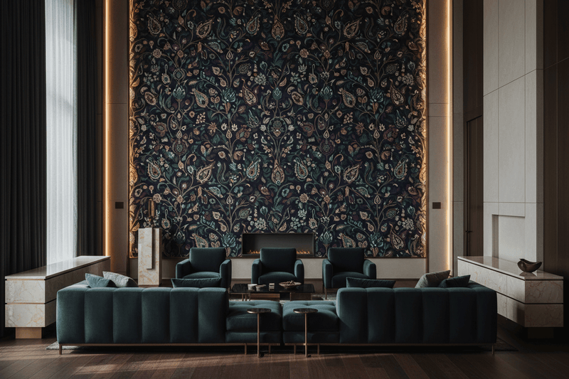
- Large-scale patterns: Bold, large-repeat patterns work best in rooms with high ceilings and generous floor area. They create a sense of drama and grandeur that suits fine dining environments, large bar areas, and statement entrance halls. In a smaller space, a large-scale pattern can feel overwhelming — unless that is precisely the effect you are after.
- Medium-scale patterns: The most versatile option for restaurant interiors, medium-scale patterns add visual richness without dominating the space. They work well in main dining rooms of standard ceiling height, creating an atmosphere of considered luxury without sacrificing comfort.
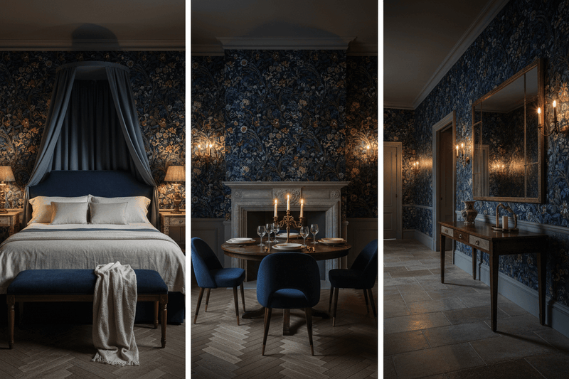
- Small-scale and all-over patterns: Fine, intricate patterns read as textural at a distance and reveal their complexity up close — ideal for intimate dining rooms, private dining spaces, and wine bars where guests linger and the walls are experienced at close range over the course of an evening.
Colour Mood: Setting the Emotional Register
Colour is the most immediate communicator in any interior, and in a restaurant it shapes the emotional experience of dining in ways that guests feel but rarely articulate. Consider what you want guests to feel — and choose your wallpaper palette accordingly.
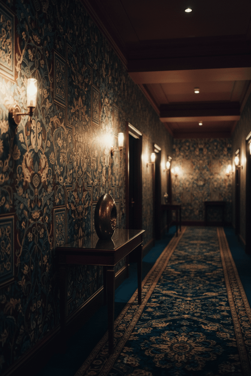
- Deep, jewel-toned grounds — midnight blue, forest green, burgundy, deep plum: These create intimacy, warmth, and a sense of occasion. They are ideal for fine dining environments where the goal is to make guests feel they have arrived somewhere special. Candlelight and warm-toned bulbs bring these palettes to life.
- Warm neutrals and earthy tones — terracotta, saffron, aged ivory, warm sand: These create a relaxed, convivial atmosphere that suits casual dining, wine bars, and neighbourhood restaurants. They are forgiving in mixed lighting conditions and age gracefully.
- Bold contrast — black and white, black and gold, navy and cream: High-contrast palettes create energy and visual impact. They suit modern brasseries, cocktail bars, and restaurants with a strong graphic identity. They photograph exceptionally well, making them a natural choice for venues that rely on social media visibility.
Durability: The Practical Realities of Restaurant Wallpaper
A restaurant interior must withstand conditions that would destroy a domestic wallpaper within months: humidity from kitchens, condensation, contact from guests and staff, and the inevitable marks and scuffs of a busy service environment. When specifying wallpaper for a restaurant, durability is not a secondary consideration — it is a primary one.
- Non-woven substrate: The standard for commercial applications. Dimensionally stable, tear-resistant, and strippable without wall damage. Essential for any restaurant installation.
- Washable surface: A washable or scrubbable rating allows marks and stains to be cleaned without damaging the print. In a restaurant environment, this is not optional.
- Fade resistance: High-quality digital printing on premium substrate produces colours that remain stable under artificial lighting and do not fade over time. Cheap printing will show its age within a year in a restaurant environment.
Carta Noor wallpapers are printed on a premium washable non-woven substrate — combining the visual richness of design-led pattern with the practical durability that commercial environments demand.
Restaurants That Made Wallpaper Their Signature
The most celebrated restaurant interiors of recent decades share a willingness to commit to a strong wallpaper choice and build the rest of the room around it. Consider the deep botanical murals of London's Sketch, the maximalist floral excess of New York's The Polo Bar, or the geometric tilework-inspired walls of Istanbul's finest meyhanes. In each case, the wallpaper is not decoration — it is the room's identity, the element that guests remember and return for.
In Budapest, the city's rich heritage of Ottoman geometry, Art Nouveau ornament, and Central European craft tradition offers a uniquely rich vocabulary for restaurant interiors. A dining room that draws on this heritage — through geometric wallpaper rooted in Ottoman design or botanical patterns inspired by the Eastern floral tradition — creates an atmosphere that is both locally resonant and internationally distinctive.
The Social Media Dimension
In 2026, a restaurant wallpaper that guests want to photograph is a wallpaper that works for your marketing. Culturally distinctive, visually striking patterns generate organic social media content that reaches audiences no paid campaign can replicate. The key qualities of a photogenic restaurant wallpaper are: strong colour contrast, clear pattern structure, and a sense of depth and complexity that rewards the camera.
Carta Noor's geometric and botanical collections — rooted in Islamic, Ottoman, and Persian decorative traditions — offer all three qualities. They are beautiful enough to photograph, distinctive enough to be recognisable, and meaningful enough to invite the question: where is that from? In a restaurant context, that question is the beginning of a conversation — and a reservation.
Carta Noor for Restaurant Interiors
Our geometric and botanical collections are designed for spaces where beauty and durability must coexist — where the walls must look extraordinary on opening night and continue to look considered three years later. Our made-to-measure service ensures a perfect fit for any wall configuration, and our washable non-woven substrate meets the practical demands of a commercial dining environment.
If you are designing or redesigning a restaurant interior and want walls that define the room rather than merely fill it, we would be glad to discuss your project. Explore the Carta Noor collection, or contact us directly to talk through your vision.